DesignItMakeIt LoveIt
A guide to the design and making of the π (Pi) cabinet.
Part II; Creating the design.
Initial sketches with pencil on paper.
I came up with several initial ideas which I pursued in sketches. To start with I was trying to create something which was mostly straight lines, because a small amount of research in traditional Japanese cabinets will reveal that most of them do not actually contain any curves.
Despite this fact, it became obvious that my own Western view of what Japanese furniture should look like was informed both by their Architecture and their furniture. I came to realise that the shape that stood out most in my mind was actually derived from the traditional shape of a stool.
There should be a picture of a Japanese stool here, but I could not find one I could use for free. When I get round to making one, I’ll post my own photo.
I started with something that was more of a development from my Japanese-inspired adjustable shelving, (except in this case the brief was to be not adjustable). There are quite a few elements of these designs I like, such as the wave patterns, and the single central display cabinet, but you can’t include everything, at least, not within one design. You can of course revisit your old designs later and see what you might still want to come back to make.
I do have a tendency to include curves in my designs at the initial stages, not because they usually offer any practical benefit, but they are often more aesthetically pleasing than straight lines. In the left-hand sketches below I let my imagination run away with itself a little. I do really love some of them, and will hopefully return to them, but I moved on from here, not so much because they might be too difficult, but mainly because I felt they didn’t really fit the brief of having a Japanese influence.
There were quite a few sketches in between the left-hand and right-hand pages, but the later ones were me trying to restrict myself to straight lines only, although I clearly started to fail in that as I moved down the page. A new element that was creeping in at this point was the asymmetrical cantilevered design, which looks like it might be impossible to make – and maybe that is true, but I think I know how it could be achieved (other than just screwing them to the wall of course), and at some point in the future, I intend to find out.
Onto the computer
I would always aim to get the initial shape and proportions sketched out before putting a design into the computer. I think of sketching as pictorial brainstorming, where I have the freedom to imagine almost anything including a lot of things that would be impossible to make.
What I find impossible with sketches is to refine the exact proportions, shapes and dimensions. Sometimes I will start to do this with models, but usually, this is where the computer-aided design comes into its own. It is (relatively) easy to move a shelf a few millimetres to the side or to taper the curve of a leg slightly more or less at selected points in ways that cannot be done accurately enough in a sketch or quickly enough on a model.
These first images from Sketchup (I had not used Fusion 360 at this point), show how I took a large part of the last sketches above and refined the dimensions on the computer. I then printed those out and sketched over of them with a pencil which is when the final design started to appear. I probably wouldn’t do it like that now because Fusion is a lot better than SketchUp for curves, and if I wanted to do it freehand, I would export the CAD file onto the tablet and use a sketching package there.
I had been using Sketchup initially, which is somewhat limited when it comes to showing colours and creating curves. When I found myself stuck at home during the first lockdown I took the opportunity to start learning Fusion 360, which is much better, but somewhat overwhelming in how much there is to learn, especially once I realised the rules stated that if I wasn’t able to work from home then I was actually allowed back into the workshop.
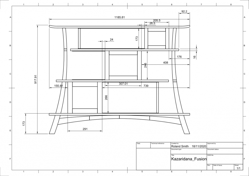
Fusion is also better at creating 2D drawings than Sketchup. This is the design I produced after a few weeks of learning fusion;

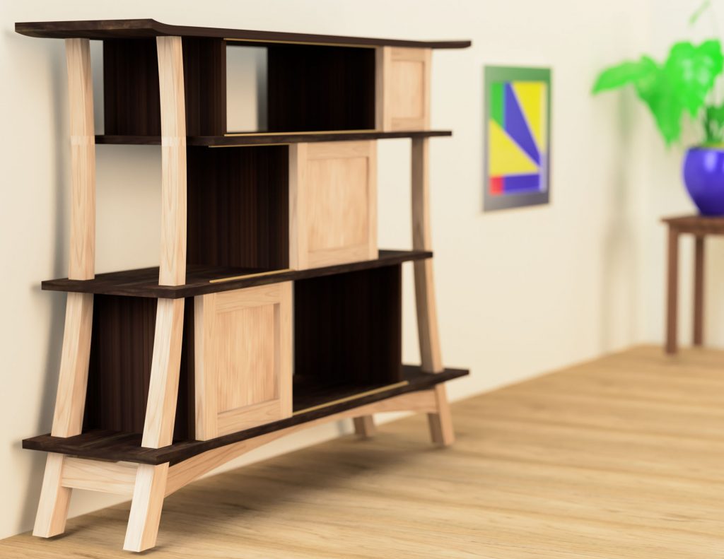
But one area (of many) where Fusion really excels over Sketchup is in creating a “photorealistic render” . This is what a beginner can do with the design above when he adds a few materials to the components and leaves it running overnight;
I have seen much better examples, but I think that isn’t bad for an early attempt. You can see how you can even adjust the depth of field. Here, I have used a low depth of field and put the focus on the nearest leg.
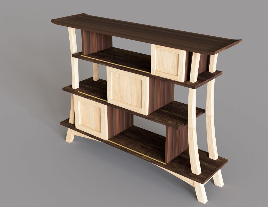
It is handy to be able to change the materials in Fusion. I was trying to decide whether or not it would look better ebonised so I initially made it in Walnut, but then edited the material “walnut” to be a lot darker so I could get a feel for the difference;
An Animation
This is the animation I did a week ago showing it being put together. Unfortunately, the animation part of Fusion relies on having a really good top-down structured approach to the design, which was a bit lacking in mine as it was only the second or third one I had used the software. I have tried to go back and fix it, but that is a lot harder than getting it correct in the first place.
I didn’t really use this as part of the design, but it will be a useful technique for demonstrating future concepts, especially ones that move. Anyway, this is OK, but probably not as good or as useful as future animations will be;
A not remotely accurate animation showing the piece being put together.
Customer Visit
Before the “events” of 2020 however, I was still able to visit the customer in his office in London to discuss what he did or did not like about the design I had done for him. It is impossible not to be a little worried at this point because, however much I might like the ideas I am presenting, it is impossible to be sure that the most important person in the whole process will feel the same way.
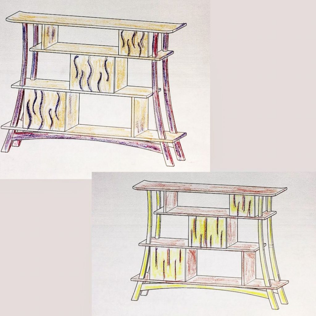
At this point, I had not learnt to make realistic pictures in Fusion, so I just coloured in a couple of Sketchup printouts, as well as including one or two technical drawings. Fortunately, the customer had a good enough imagination to see through the limitations of these drawings;
I was delighted to hear that he liked the design as it was, with no fundamental changes. I suggested a few options for materials but he agreed that the best one would be a figured sycamore or maple for the curved parts and a darker wood for the shelves. He did suggest the addition of a burr veneer lining for each individual cupboard in order to create a “big reveal” when the doors are opened on his most prized exhibits.
He particularly liked the idea of using an ebonised finish for the darker components, which I had suggested because it felt very Japanese to me, even though that feeling probably derives more from their architecture than their furniture.
I hadn’t actually done this render at the time, but here is one I produced later, demonstrating the ebonised finish;
The general idea for putting marquetry on the doors also came from the customer, although that was a later addition and will be discussed in a later post.
Of the above Designs, which am I most keen to revisit?
There are several elements I explored above, but which didn’t make the final cut, that I am extremely keen to develop further. In particular, I hope to carry on developing the more tree-like designs in the left hand sketches and the cantilevered assymetrical, but straight(ish) designs to the right of them. I may have to wait until someone commissions them as I don’t have space for any more speculative pieces at the moment, but I will aim to make scale models of the cantilevered design just to check that I can do it (or not).
Part III of DesignItMakeItLoveIt, the design and making of the π (Pi) cabinet will cover;
The materials employed and some of the choices made about those to use and those not to use.


